GrupoNar implemented a transaction tracking feature in their website
This case study explores the UX/UI design journey for the addition of a tracking feature for Grupo Nar's clients.
Project Overview
Role: UX/UI Designer
Industry: Legal/Real Estate
Deliverables: UX/UI Design, User Research, Figma Prototype
Duration: 15 Days [36 hours]
Introduction
In May of 2023, The Value Crew was approached by Grupo Nar Legal Consultants to enhance their website's user experience and interface for property transaction coordination.
Being the Lead designer at the value crew, my role would be to gather the information, conduct research, communicate with the development team along with the Grupo Nar Team to create the best solution possible.
Problem
Most property transactions in the and real estate industry followed a standardized process, but language barriers and limited legal knowledge resulted in client difficulties. This lack of accessibility and understanding created obstacles for clients in navigating the transaction journey effectively.

💡 Key Issue: The clients would get frustrated because they could not track their property closure process.
Objective
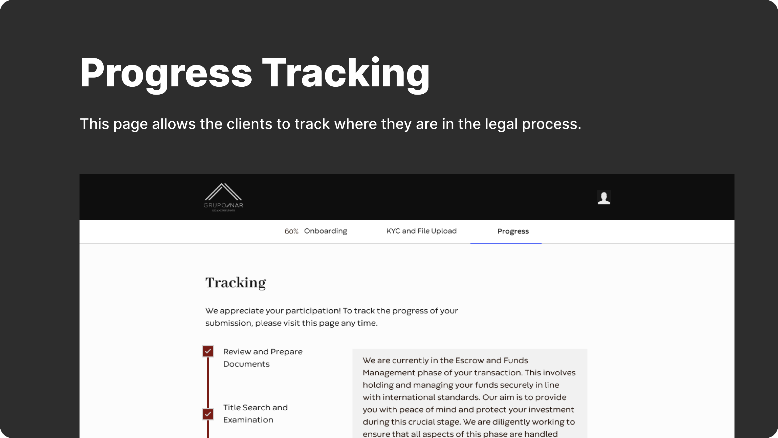
The objective was to integrate a tracking feature that would allow clients to monitor the progress of their property transaction until it was ready for the deed signing. Given that most transactions follow a standardized process, the solution involved creating a user-friendly interface for selecting and tracking tasks associated with each transaction.
💡 Goal: Integrate a tracking feature allowing clients to monitor transaction progress.
Research & Discovery
During the initial phases of the project, our primary source of information was the internal team at GrupoNar, the company specializing in closing coordination for property transactions in Mexico. While respecting confidentiality, we engaged in a collaborative dialogue to gain valuable insights into their operations and client needs.
The target user base for this platform primarily comprises clients GrupoNar is already serving.

💡 User Insight: The users typically fall within the age range of early forties to late fifties and not very familiar with Technology.
User Persona
Based on the findings from our research, our users would have two main persona.
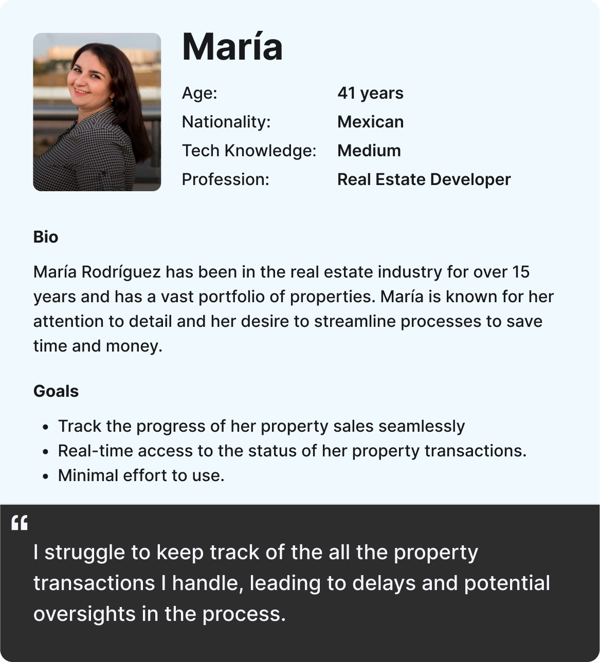
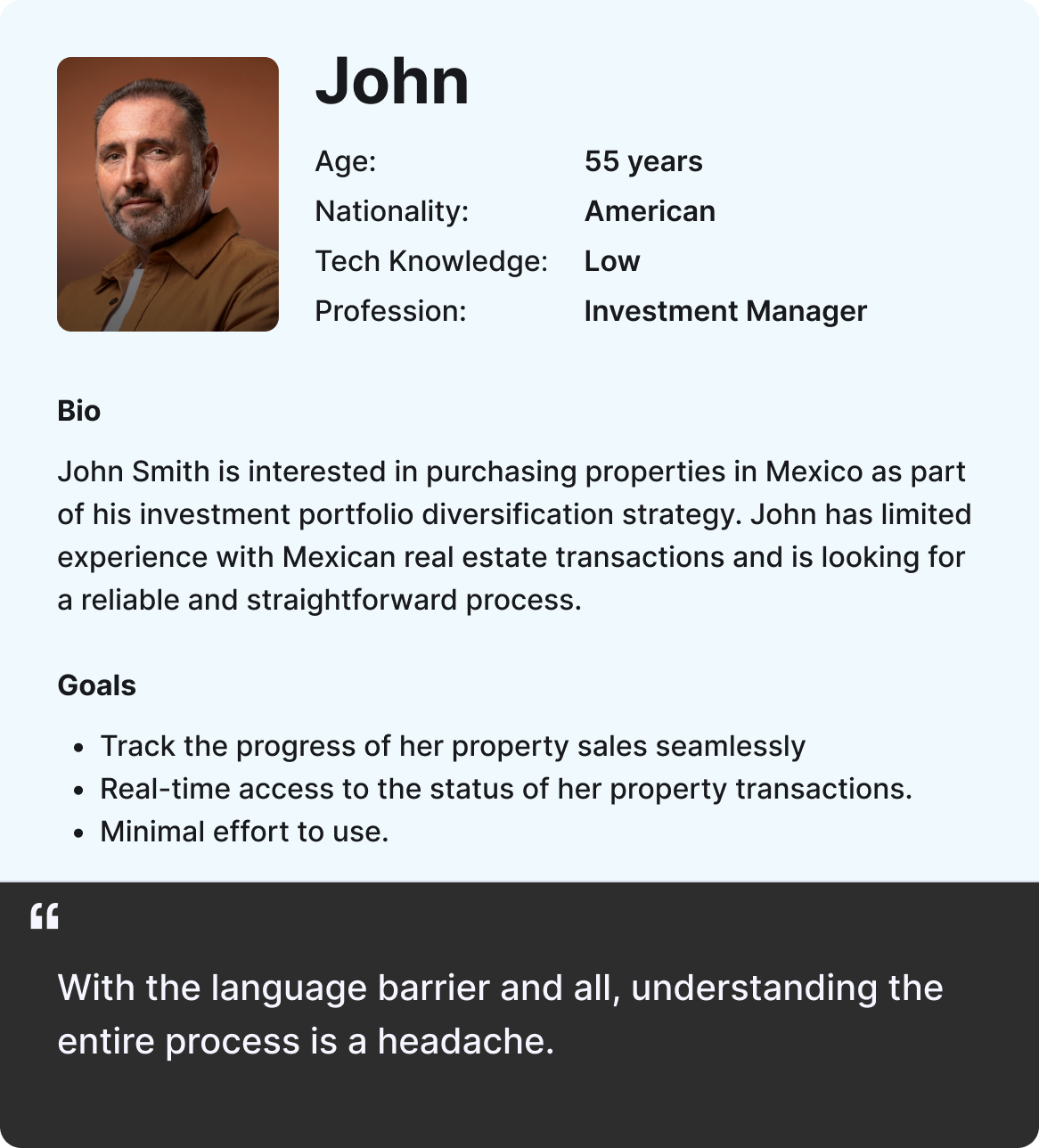
💡 Design Principle: The design needs to be straight forward and laid out as simply as possible.
Creating a user flow
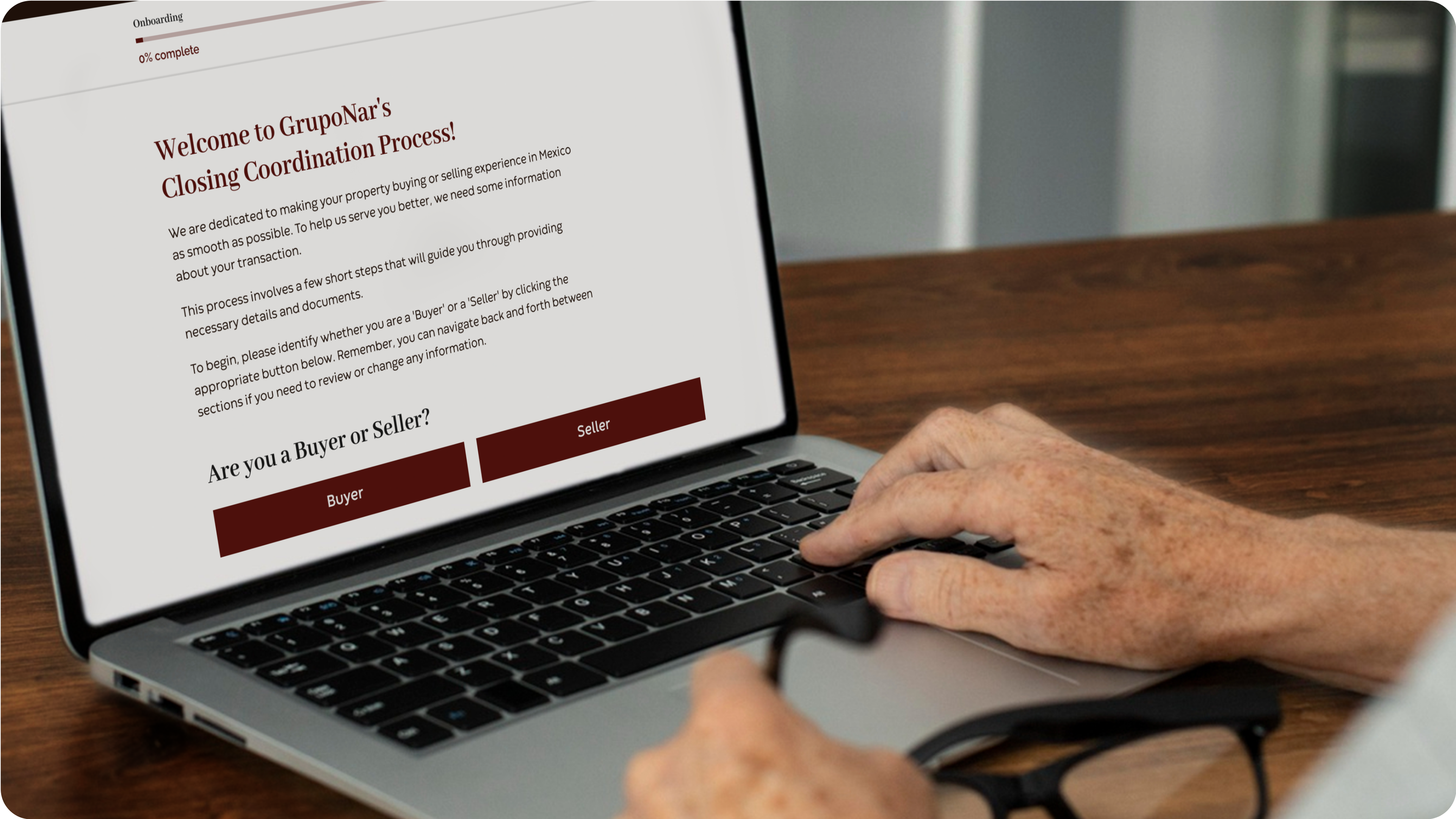
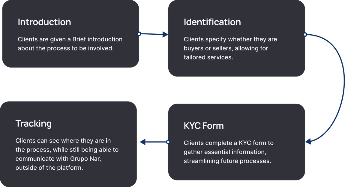
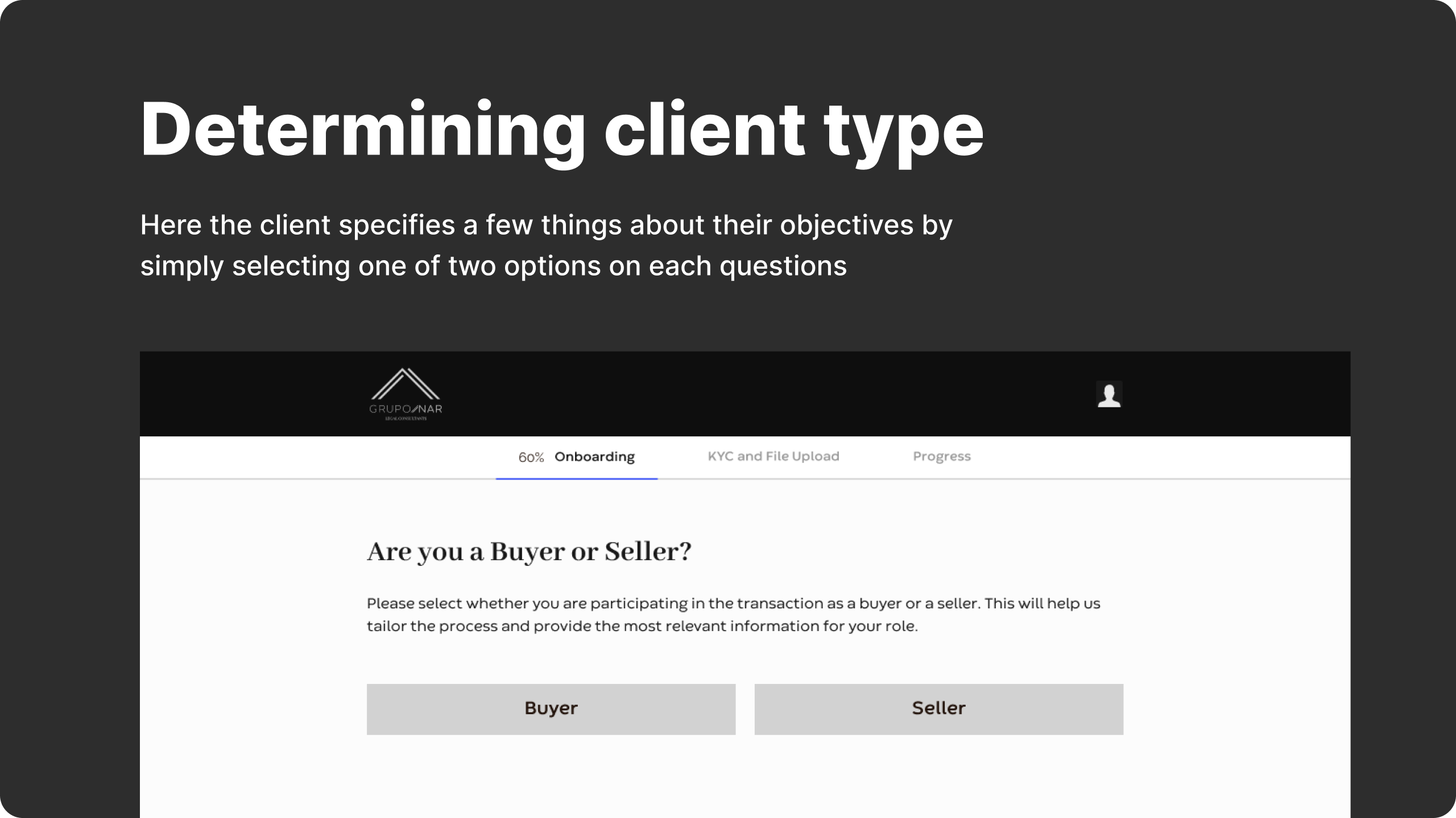
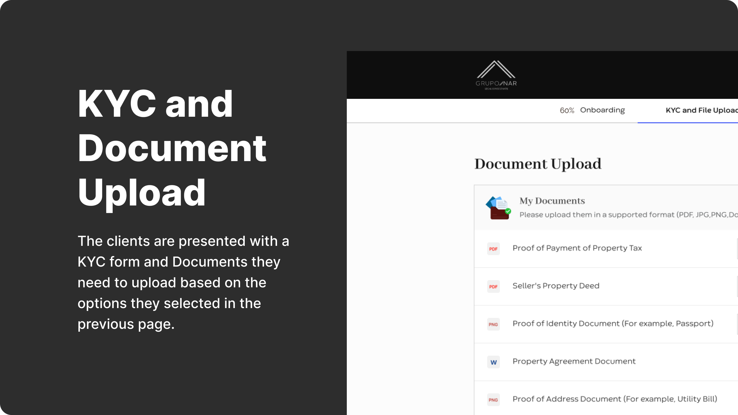
Together with the Grupo Nar team, we crafted a user flow that aligned with their standardized workflow. This user flow would consist of the following key steps:
Alignment with Branding Guidelines
We streamlined GrupoNar's brand identity by consolidating typefaces for consistency. Our design approach emphasized minimalism and trustworthiness, catering to the mature user demographic (early forties to late fifties). This research phase ensured our design aligned seamlessly with GrupoNar's brand and user demographic.
💡 Brand Strategy: Streamlined typeface selection for greater brand consistency and tailored design for GrupoNar's mature user demographic.
Design Process
With insights from the Discovery phase and drawing from my experience on similar projects, I took on the design process, exploring two distinct approaches:
1. Single-Page Design:
This approach offered users a continuous scrolling experience, where they could seamlessly fill in all the required information on a single page. It aimed to simplify the user journey and condense the interaction into a unified experience.
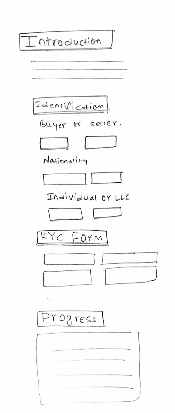
User scrolls through the page completing the process and being able to see the progress.
2. Multi-Page Design:
Alternatively, I proposed a five-page design structure. Each page was designed with a specific purpose in mind, creating a guided and structured user journey.
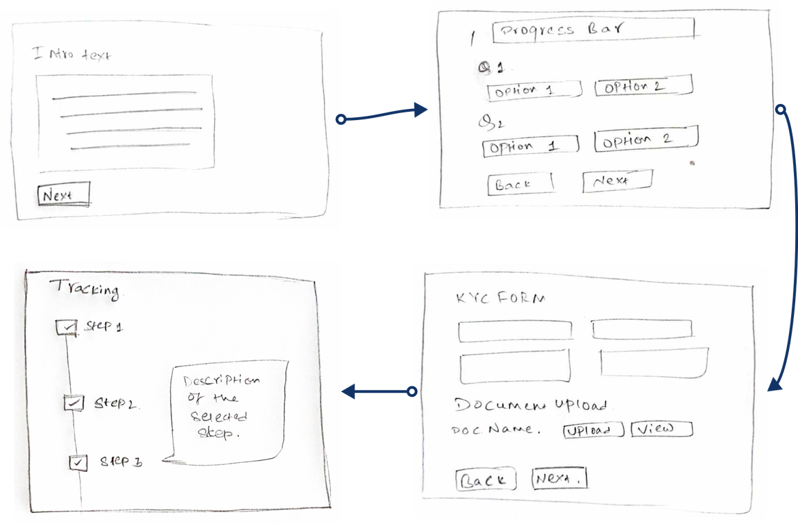
The multi-step design structure provided a structured and user-friendly experience while retaining the flexibility required for GrupoNar's clients.
User goes through a series of pages being able to move back and forth when required.
Following extensive discussions with the GrupoNar team, I opted for the multi-step approach where the users could move back and forth between stages, allowing them to complete their tasks at their own pace, over time.
💡 Final Decision: Multi-Page approach was taken.
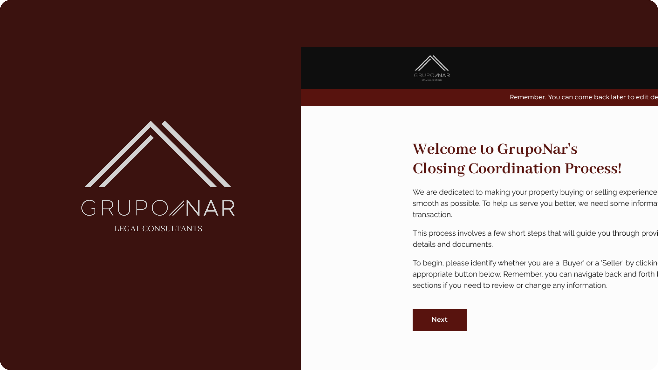
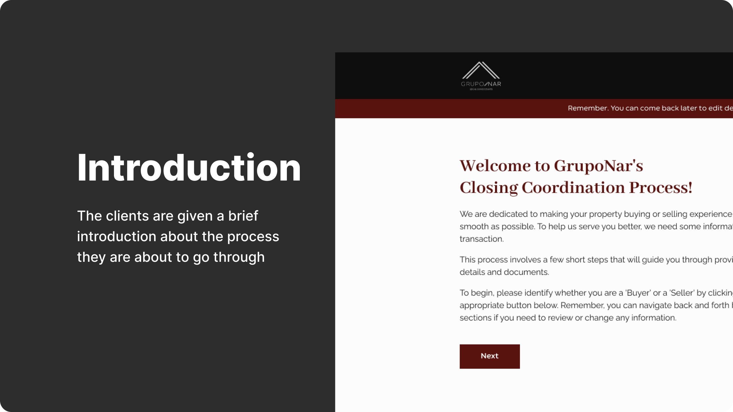
Hi Fidelity Mockups
Following the Multipage design approach, I created a Hi-Fidelity mockup for each page.
Final Prototype
Taking the sketches for the Multi step design as a reference, I created a clickable prototype on Figma. Try it out here.
Conclusion
The platform is now live and under close monitoring of The Value Crew team. We will be making necessary changes in the future based on the user feedback.
To wrap things up, even in a straightforward project, I've been reminded of the basics of putting users at the center of design. Making things easy for users, and working well with others are key for making a design that works and makes users happy. These principles work in any project, no matter how simple, and make sure the user experience is a good one.
💡 Project Status: Platform is live, continuously monitored by The Value Crew. Future improvements based on user feedback. Emphasis on user-centric design principles and collaboration for a successful project.
Contact Information
Email: imkishor24@gmail.com
Phone: +977 9861016552
My Resume