NATHM got their college website redesigned
This case study explores the process of redesigning the NATHM college website to enhance its user-friendliness and visual appeal.
Project Overview
Role: UX/UI Designer
Industry: Education
Deliverables: UX/UI Design, User Research, Figma Prototype
Duration: 20 Days [50 hours]
Introduction
The clients knew something was wrong, but not exactly what. They wanted to make the website "Beautiful and modern"
In this phase, my job would be to find the problems in the existing NATHM's website and present it to the stakeholders in the simplest way.
Finding the problem
Hero section Audit
Upon close inspection of the existing website's hero section, I found it suffers from outdated design, disorganized information, and usability issues, negatively impacting user experience and engagement.

💡 Problem Identified: Anyone who landed on the website would just get confused.
Okay, but how do we solve this?
Having identified the chaos, I focused on eliminating the problems, one at a time.

💡 Solution Implemented: Works much better!!
Now I just had to do the same thing for the entire website. Simple as that.
User Personas
Our redesign catered to two distinct user personas.

💡 Design Focus: We need to design with their needs in mind.
Objective
The objective was to redesign the website with the following goals in mind:
- Enhance User Experience: Create a modern and user-friendly design that caters to the needs of prospective students, current students, and parents/guardians.
- Improve Information Organization: Streamline content presentation and navigation to ensure that users can easily access relevant information.
- Maintain Unique Identity: Preserve the unique character of the NATHM college while aligning with contemporary design standards.
💡 Goal: Provide a seamless and informative online experience for all its users.
Analysis
I took screenshots of each page from the existing website to understand what information i was going to be dealing with. It was revealed that the information was unorganized and redundant.
💡 Key Finding: The information needed organization (Group related information & separate non-related ones.)
Information Architecture
I subsequently categorized information that should be grouped together and identified elements that required separation.
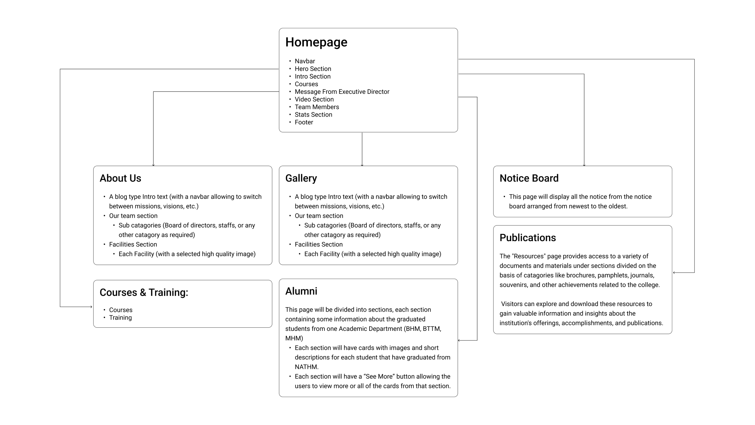
💡 Foundation: This would be the base for the redesign.
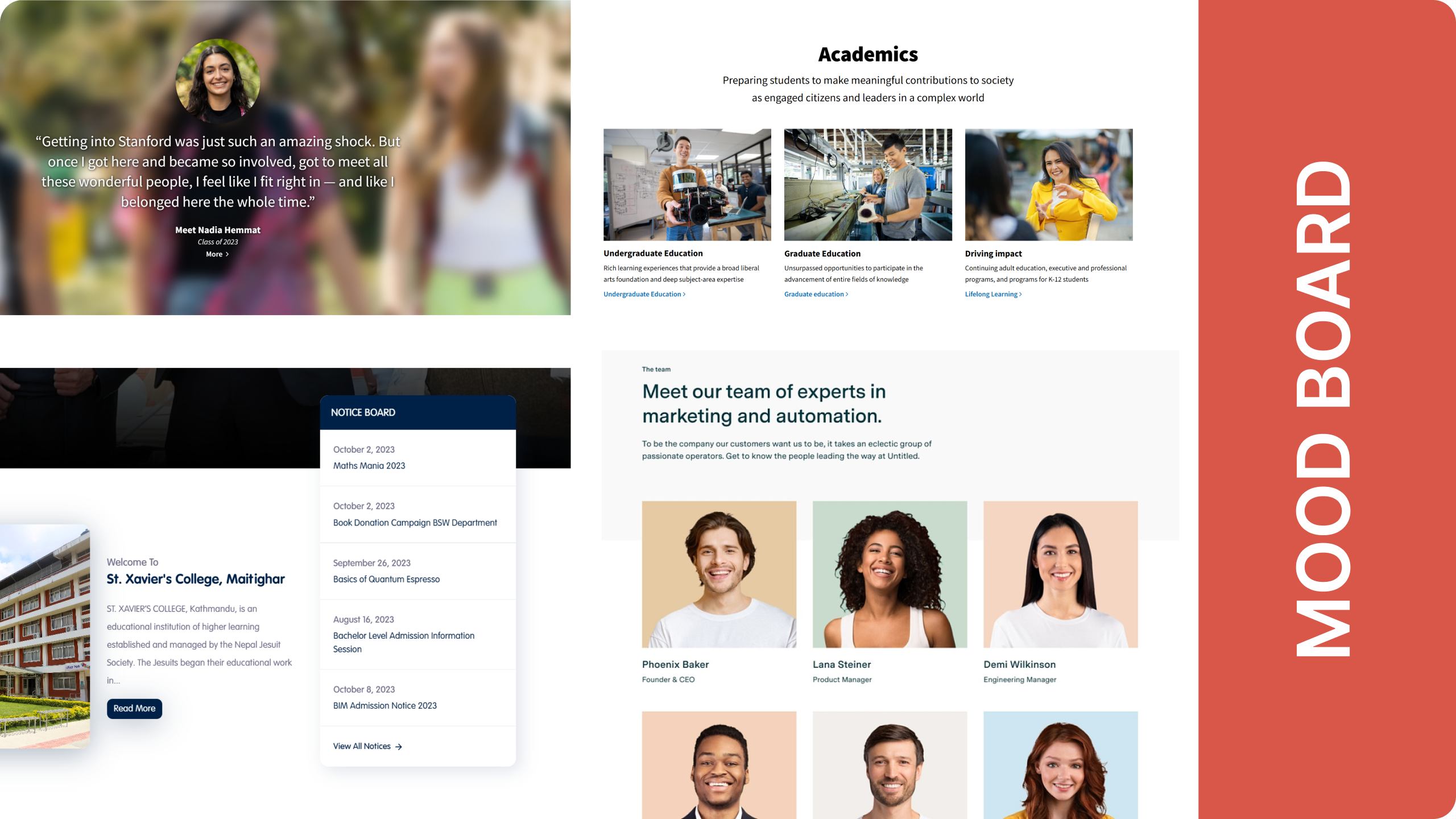
Design Inspiration and Ideation
References
The design inspiration drew from certain sections of prominent educational websites, with a particular focus on Stanford University and St. Xavier's College. These sources inspired the design direction for the NATHM website.
Wireframing
Mid-fidelity wireframes were developed to visualize how content would be presented on the website. These wireframes concentrated on improving user interaction and navigation, simplifying access to essential information.
💡 Layout Foundation: A base layout was created.
Design Decisions
The original website suffered from disorganized information, resulting in an excessive number of pages for content that could be consolidated onto a single page while improving navigation. Two examples illustrate our approach to solving these issues:
Example 1 - About Us
Problem: Scattered Information
Six separate pages ultimately served the same purpose: providing information about the organization.
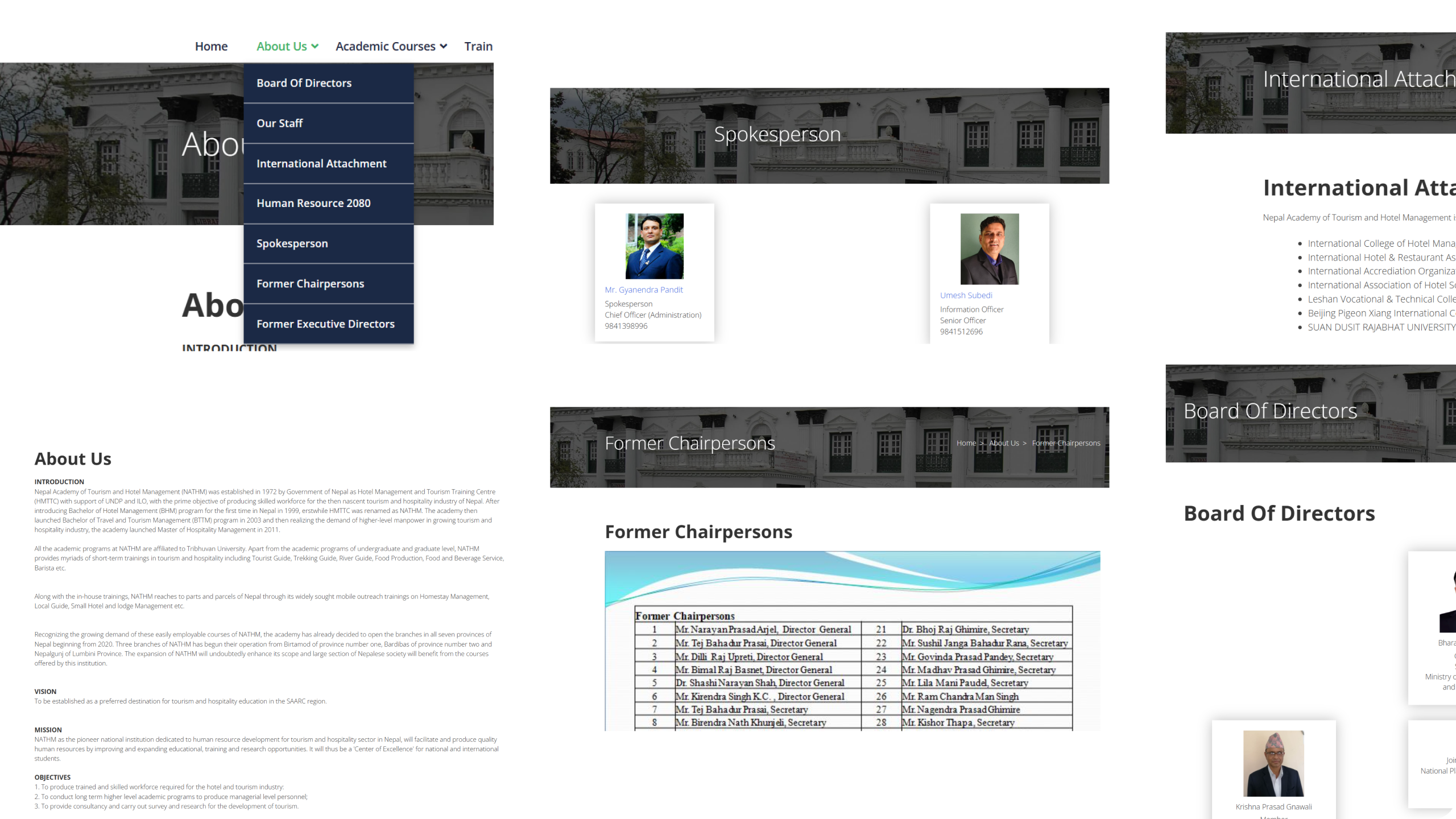
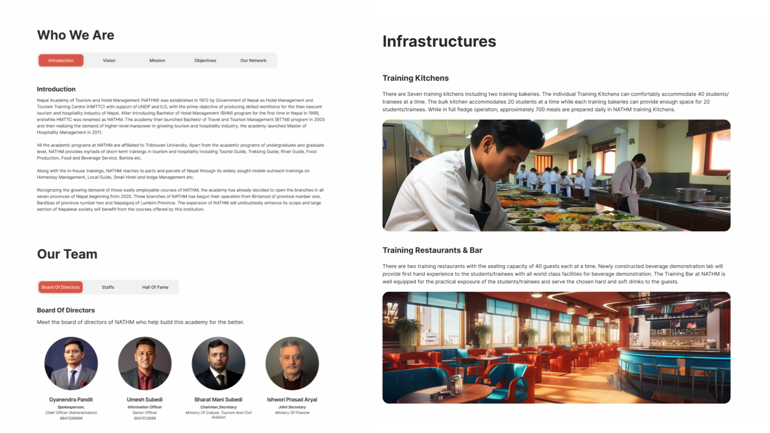
Solution: Sectional Navigation
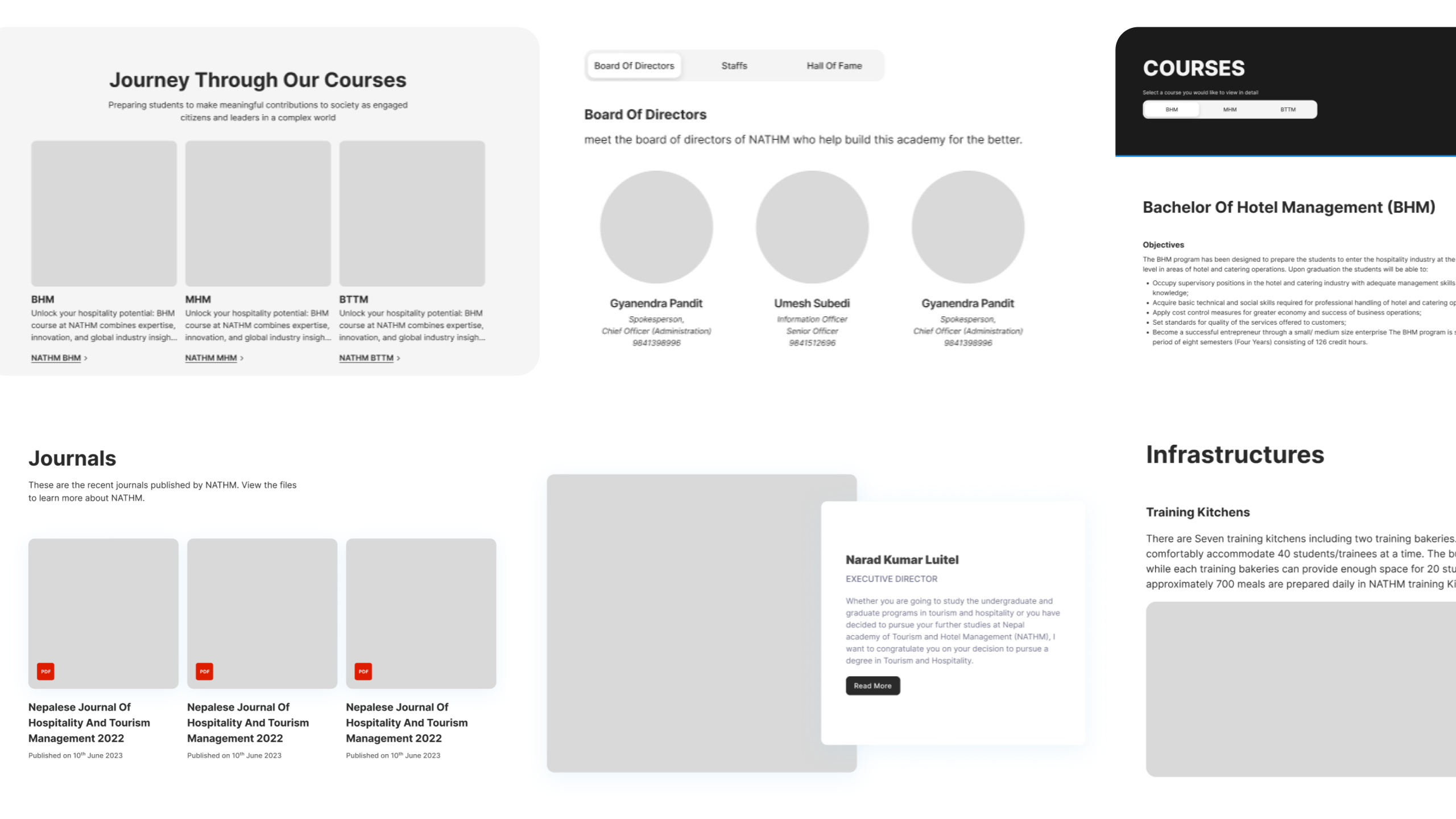
I consolidated the data from all six pages to create a unified "About Us" page. Additionally, I introduced a toggle navigation system to simplify the user's journey and enable swift access to specific information.
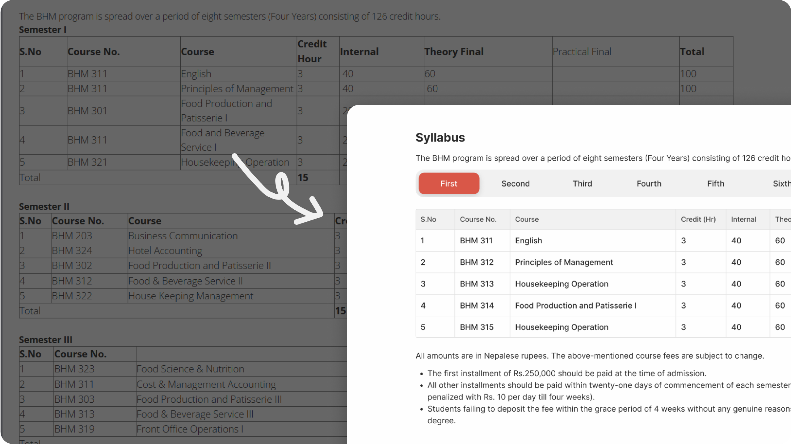
Example 2 - Courses Page
Problem: Information Overload
The original courses page presented information in a disorganized manner, making it challenging for users to navigate. The page contained a large, low-resolution image, a syllabus table, and additional information in lengthy paragraphs.
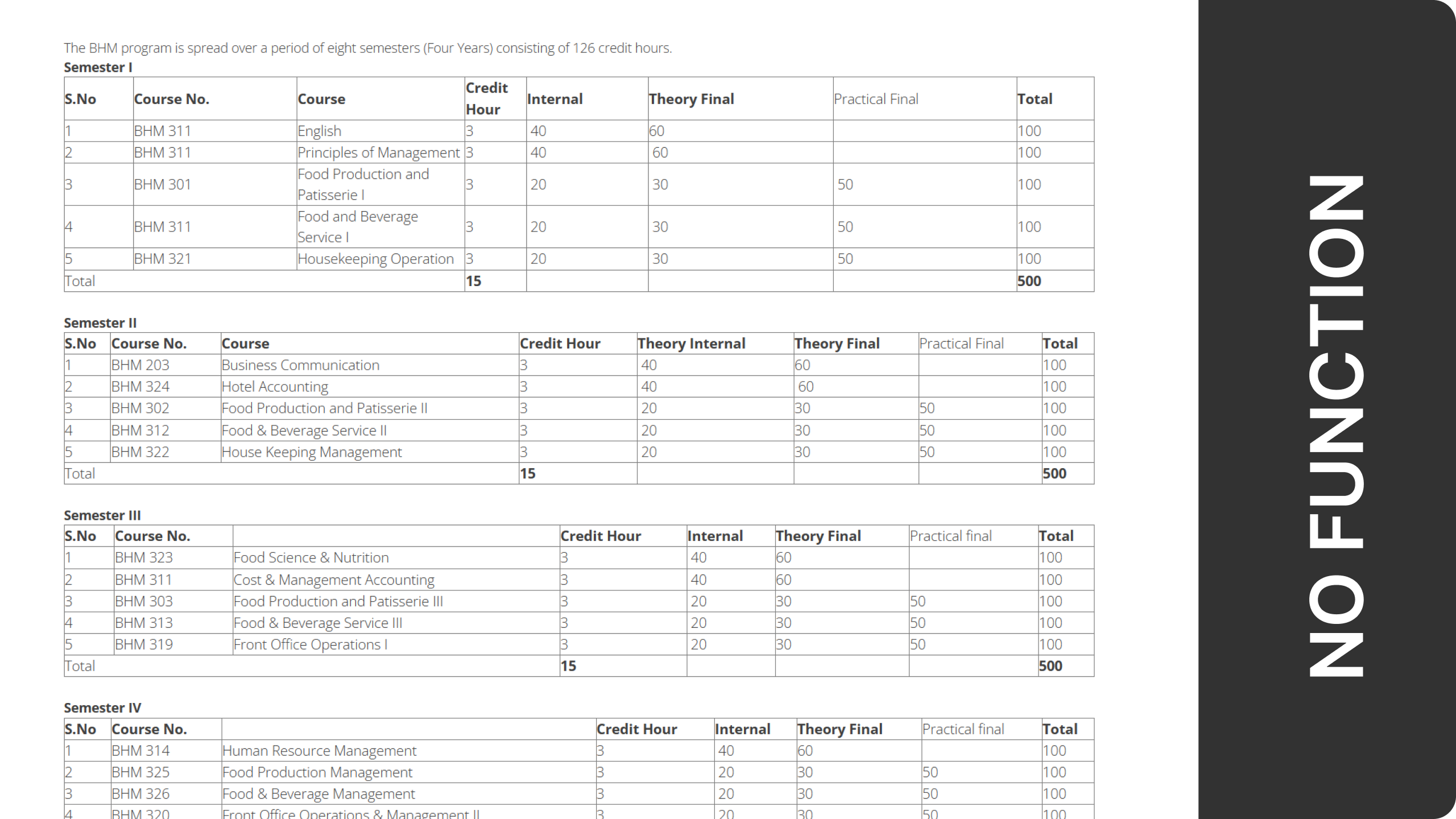
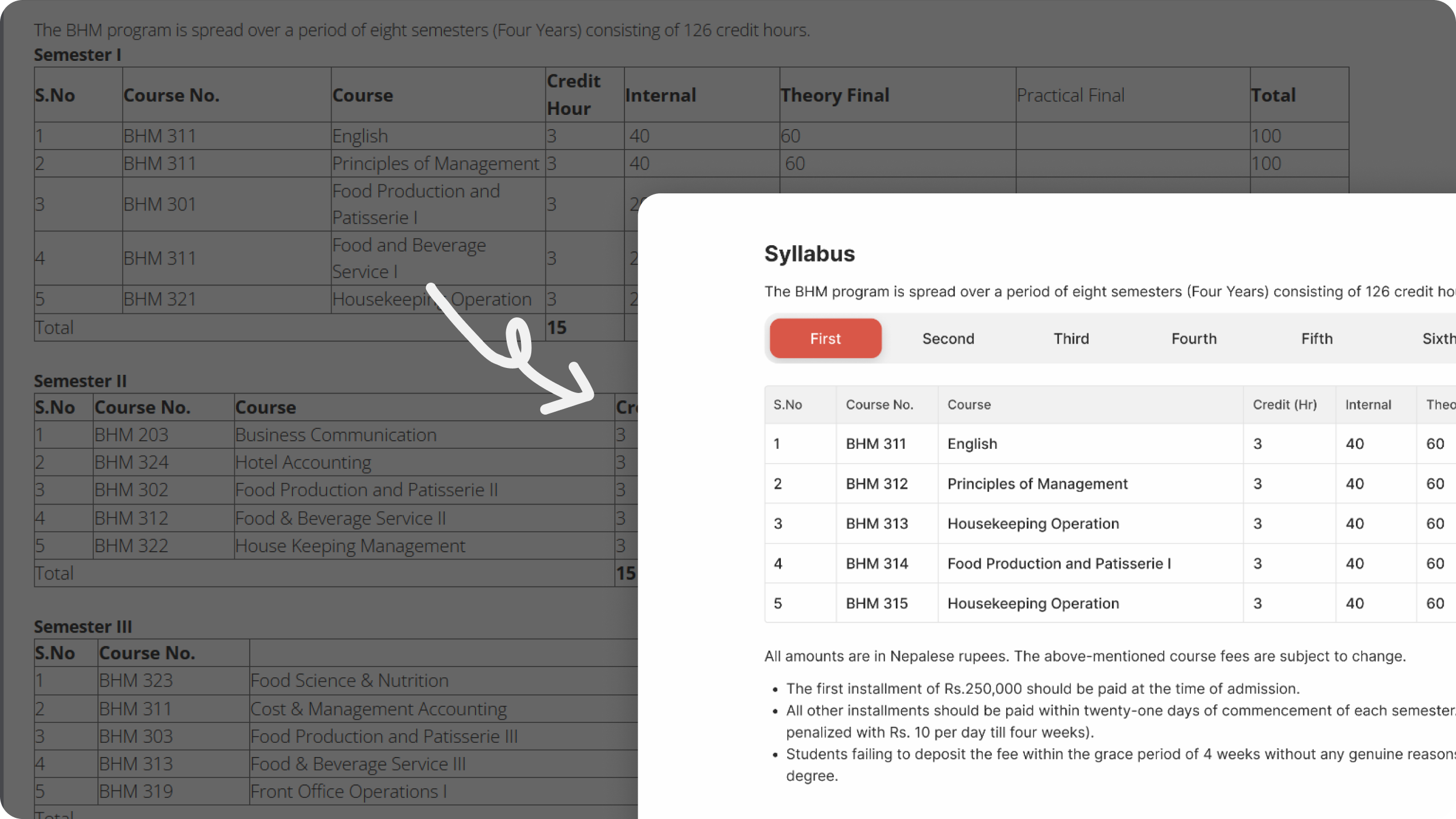
Solution: Content Chunking
The Syllabus table did not need to expand the entire page, since the primary objective of a student would be just to look at a content of one semester. Implementing toggle navigation here made it simpler for the users to access the information without having to scroll too much for the rest of the information in the same page.
💡 UX Enhancement: A few new UX elements were introduced to solve the problem.
Conclusion
The redesigned NATHM college website successfully combines modern style with intuitive navigation, ensuring that users can find information effortlessly. By reorganizing information and maintaining a clean layout, we have simplified the user experience.
💡 Project Status: Platform is under development by The Value Crew. Future improvements based on user feedback.
Contact Information
Email: imkishor24@gmail.com
Phone: +977 9861016552
My Resume